
The best Webflow templates in 2026 cover the four things most people actually need a Webflow site for: showing work in a portfolio, selling a service through an agency page, running a small ecommerce catalog, and publishing a blog or news feed. This list features 10 templates from the official Webflow marketplace, each with a real price, an honest read on what it does well, and a clear note on who it is best for.
Every template here is a paid marketplace template rather than a free clone. That is a deliberate choice: paid templates come with founder-quality design, Client-First class naming, and Webflow University tutorials tied to the theme, which turns hours of setup into an afternoon. Prices range from $29 to $129, and any of them can be purchased once and used on a single site.
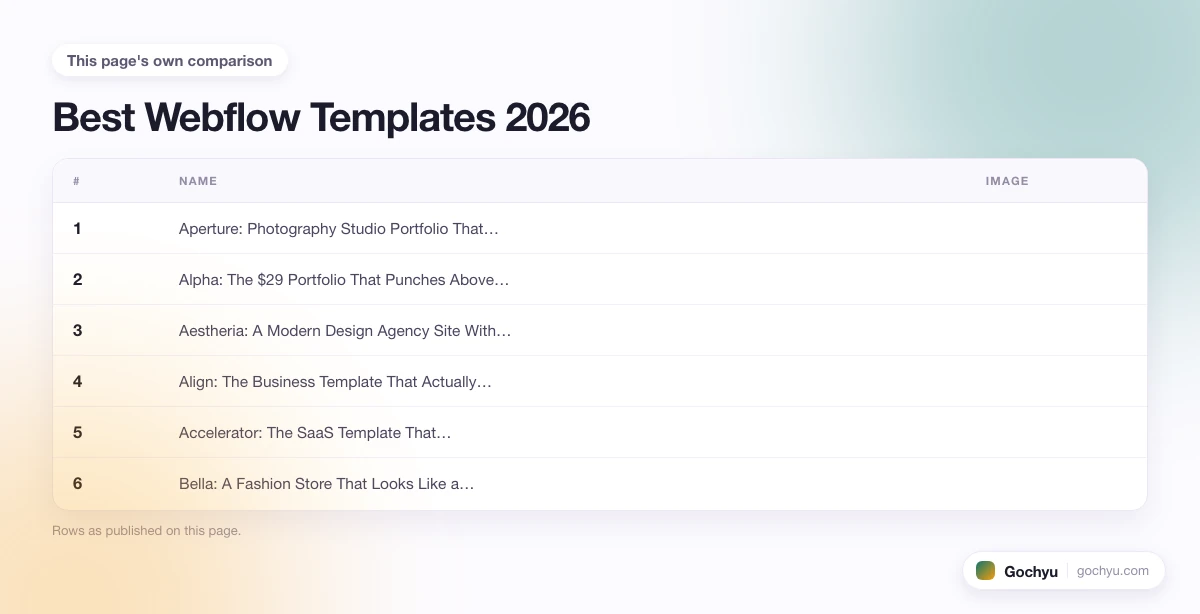
| # | Name | Image | |
|---|---|---|---|
| 1 |

|
More Info | |
| 2 |

|
More Info | |
| 3 |

|
More Info | |
| 4 |

|
More Info | |
| 5 |

|
More Info | |
| 6 |

|
More Info | |
| 7 |

|
More Info | |
| 8 |

|
More Info | |
| 9 |

|
More Info | |
| 10 |

|
More Info |
* read the rest of the post and open up an offer
What Makes a Good Webflow Template?
A good Webflow template does four things at once. It uses Client-First class naming so the CSS stays readable when you rename or duplicate sections. It ships with a working CMS collection (blog posts, projects, products) rather than dummy static pages. Its interactions and animations are tied to reusable components, not one-off page elements. And its style guide includes typography, buttons, and colour swatches wired to shared symbols, so a global font change updates the whole site instead of one page.
The other test is honesty about scope. A single-page landing template is fine at $29, but a full agency or ecommerce site with a blog, case studies, and 20 CMS-driven pages is worth $79-$129. The templates below are labelled by real category and real price so you can pick without guessing.
Best Webflow Templates - Our List
Aperture: Photography Studio Portfolio That Lets the Images Breathe
Aperture is the template you buy when you want a photography site that respects negative space. Full-bleed hero images, thin white margins, and a typography stack built around light-weight display serifs make each photo feel like a print in a gallery, not a thumbnail in a grid. Scroll interactions are slow and quiet, which is exactly right when your work is the loud element.
The layout puts three big decisions in front of you on the home page: featured project, an editorial-style writeup, and a contact block. That is unusual for a photography template, which usually forces you into a masonry grid. Aperture assumes you have opinions about what to show first, and it gives you room to say so.
Underneath, the CMS collection for projects is well-structured: a hero image field, a gallery field with grid layout options, a rich-text field for the story behind the shoot, and a related-project reference field. Project pages inherit typography from the style guide, so once you set the type stack for the home page the rest of the site follows without extra work.
The one honest downside is that the template does not include a store or print-sale integration out of the box. If you sell prints as your primary revenue, plan on extra design time to add a Webflow Ecommerce section, or start with Bella instead. For portfolio-first work with a soft contact CTA, Aperture is the strongest pick under $50.
Why Aperture Earns the Top Slot
- Editorial hero layout - swaps the standard image grid for a magazine-style feature block, which reads more like a gallery show than a stock portfolio.
- Slow-scroll interactions - the parallax and reveal timings are dialled down, giving photos time to load and be seen instead of racing past.
- Structured project CMS - fields for hero, gallery, story, and related work, so each project page has depth without extra pages to build.
Alpha: The $29 Portfolio That Punches Above Its Price
Alpha is the cheapest strong template on this list at $29, and it holds its own against picks costing three times as much. The design leans creative-agency more than personal portfolio, with a bold display serif, oversized project cards, and generous white space that reads as confident rather than empty. It works equally well as a solo designer portfolio, a two-person studio site, or a small agency landing page.
The home page is built around a hero statement and three project cards, each of which links to a detailed case study page. Project pages get their own hero, a horizontal-scrolling image strip, and space for the process story. This case-study focus is what separates Alpha from the cheaper free templates, which usually stop at a thumbnail grid.
What is missing at $29 is a blog. Alpha ships with a projects CMS collection but no articles collection, so if you plan to publish regularly you either add one yourself or pair Alpha with a subdomain blog. That is easy enough in Webflow, but it is worth mentioning up front.
Why Alpha Is the Best Value Pick
- Case-study depth - project pages come pre-built with hero, process, and results sections instead of just an image gallery.
- Bold display serif - typography reads high-end even before you swap the placeholder fonts, which is rare at this price point.
- Flexible for solo or team - the About and Services sections handle a single-name business or a two-person studio without restructuring.
Aestheria: A Modern Design Agency Site With a Client-Ready Feel
Aestheria is what a client will imagine a design agency site should look like: a soft off-white background, restrained animation, a services block with clear pricing tiers, and a case-study carousel that scrolls sideways instead of down. It is a good middle ground between the corporate seriousness of Align and the personal-portfolio feel of Alpha.
The home page structure is the giveaway that this template was built by someone who has actually run an agency. It leads with a positioning statement, drops straight into a proof block with client logos, then goes into services, a case study, and a two-step contact block. That is the exact sequence high-converting agency sites use, which saves a serious amount of A/B testing later.
The Services page is worth studying on its own. Each service gets its own page with process, deliverables, and pricing hint, wired to the CMS. That means the small-agency work of updating one service description propagates to the home page, the services index, and the individual page, all from one edit.
Where Aestheria Shines
- Conversion-tested home sequence - positioning, proof, services, case study, contact - in the order actual agencies use.
- CMS-driven services - one edit updates every place the service is mentioned across the site.
- Sideways case-study scroll - reads as intentional design rather than a stock template, and works surprisingly well on mobile.
Align: The Business Template That Actually Looks Like a Business
Most business-category templates look like they were designed for a stock-photo homepage of a made-up SaaS. Align does not. It has the muted colour palette, tight grid, and understated typography of a real consulting or professional-services site. Think corporate boutique rather than tech startup.
The home page starts with a large text hero (no video, no product screenshot) and moves into a solutions grid, a stats block with numbers you can actually change, and a leadership team section. That last piece is the tell: business templates that skip a team section are usually agency-first templates in disguise. Align includes it because a real business site needs it.
The style guide is where Align stops feeling like a template and starts feeling like a design system. Six typography levels, three button variants, four background utility classes, and a colour swatch tied to the whole site. Rebranding is a matter of swapping colour tokens and a font family, not editing every page.
What Align does not do well is ecommerce or CMS-heavy publishing. It has a small insights CMS collection but nothing built for regular publishing. For a professional services firm, that is fine. For a business that plans to run a real content marketing operation, Boom or Catalyst are a better fit for the blog side while Align handles the main site.
Three Reasons Align Reads as Corporate Not Cheap
- Restrained typography - one display serif, one sans, six weights. Nothing fights for attention.
- Real team section - not a stock avatar grid but a proper leadership block with roles and short bios.
- Style guide as design system - swap two tokens to rebrand the whole site.
Accelerator: The SaaS Template That Includes the Pages You Would Have to Build Anyway
Accelerator is the most expensive template on this list at $129, and it is the one that most obviously justifies its price. It ships with 40+ pre-built pages including a full pricing page with three tiers and a comparison table, a changelog, a customer-story CMS, a blog with categories, a legal template pack, and a help centre skeleton. If you are building a SaaS marketing site from scratch, that page inventory alone saves a week.
The design is confidently modern without being trendy: a dark home page hero with a subtle animated gradient, a two-tone accent, and product screenshots framed inside browser chrome. Interactions are tight but not distracting, which matters on a SaaS site where the goal is to move visitors to the pricing page as fast as possible.
Where Accelerator earns the top price is the pricing page itself. It is one of the few templates that includes a real feature-comparison table, a monthly-annual toggle wired to CMS-driven price fields, and a "recommended" tier callout - the three things every SaaS pricing page needs. Rebuilding that from scratch on another template takes at least a day.
The honest downside is that Accelerator assumes you are a SaaS. The blog is set up more for changelog-style posts than long-form thought leadership, and the customer stories collection is opinionated toward B2B testimonials. If you are running a productised service or an ecommerce brand pretending to be a SaaS, the fit is awkward.
What Makes Accelerator Worth $129
- Working pricing page - monthly/annual toggle, comparison table, and recommended tier already built.
- 40+ pre-built pages - blog, changelog, help centre, legal, customer stories, all wired to the CMS.
- Dark modern hero - animated gradient and browser-chrome screenshot frames that look current rather than dated.
Bella: A Fashion Store That Looks Like a Boutique, Not a Big-Box Site
Bella is a Webflow Ecommerce template built for fashion boutiques rather than big catalogues. The home page reads more like a curated lookbook than a product grid: a full-bleed campaign image, a two-column collection block, a story section with a portrait shot of the founder, and a small-run product carousel at the bottom. It works for a brand that treats each drop as an event.
The product page is the strongest part. Large product imagery on the left, tight product info on the right, a swatch selector for colours, and a fixed add-to-cart on desktop. Related products appear as a two-item strip below the fold, which keeps focus on the current item without hiding the upsell entirely. This is the layout most direct-to-consumer fashion brands end up building anyway.
For catalogue-scale fashion (more than around 50 SKUs), Bella starts to feel small. The collection index is designed for a curated 8-24 product view, not a filterable 200-product catalogue. If you are running a store closer to Shopify catalogue scale, look at the best Shopify themes for clothing stores instead - Shopify's theme ecosystem handles high-SKU fashion better than Webflow Ecommerce currently does.
For a small fashion label with 10-30 SKUs, however, Bella is the best fashion-first template in the marketplace. And because it uses Webflow Ecommerce natively, the checkout, tax, and shipping settings all live inside Webflow rather than a third-party plugin.
Three Details That Set Bella Apart
- Lookbook home layout - reads as editorial rather than catalogue, which suits small-run brands.
- Focused product page - single-column imagery, tight info, and a swatch selector that actually works on mobile.
- Native Webflow Ecommerce - checkout and tax settings live inside Webflow, no third-party plugin required.
Apparel X: A Full Fashion Ecommerce Site With UI Kit Included
Apparel X sits at the $129 top of the ecommerce templates and comes closest to a full store rather than a lookbook. Where Bella is a boutique, Apparel X is a mid-sized shop with proper filtering, category pages, sale and new-arrival tags, a wishlist page, and a substantial UI kit for extending the site beyond the built-in pages.
The category page is the standout. Filters live on a collapsible left sidebar, sort options sit at the top right, and product cards support hover to reveal a second image - a real ecommerce interaction, not a static grid. On mobile, the filter collapses into a bottom sheet drawer rather than a full-screen modal, which keeps the browsing rhythm going.
Apparel X also ships with a UI kit of 60+ additional components: banners, cards, badges, modals, form patterns, and empty states. That means when you inevitably need a component the template did not think of, you have building blocks that match the style rather than having to design from scratch. Compared to Bella's tighter component set, this is what you are paying an extra $50 for.
The one caveat is complexity. Apparel X has more moving parts than a beginner Webflow user should take on cold. If this is your first Webflow ecommerce build, start with Bella. If you have shipped one Webflow site before and want a store with real filtering and category depth, Apparel X is the better long-term investment.
Why the Extra $50 Buys More Than Just Pages
- Filterable category page - sidebar filters, sort dropdowns, and second-image hover on cards.
- 60+ component UI kit - style-matched building blocks for banners, cards, badges, modals, and forms.
- Wishlist and account pages - included out of the box rather than added on later.
Catalyst: An Editorial Magazine Template With a Real Article Layout
Catalyst is where most Webflow blog templates fall short and where this one clears the bar: the article page. Most blog templates give you a hero image, a body text field, and call it done. Catalyst treats a long-read article as a first-class page with a large drop cap opening, a sticky-scroll table of contents, pull quotes with real typography, and inline captioned images that snap to a wider column than the body text.
The home page is a two-column magazine layout with a big featured article at the top, a category ribbon, and a story grid underneath. Category pages inherit the same treatment, which means a section landing feels like flipping to a chapter in a real magazine rather than clicking a tag on a blog.
Where Catalyst pays off is scale. It uses CMS collections for articles, categories, authors, and issues, which means adding a hundred articles or promoting a new writer is a CMS operation not a design task. Author pages come pre-built with a bio, social links, and a list of every article by that author.
The soft downside is that the magazine aesthetic is opinionated. If you want a personal blog rather than a publication, Catalyst is overkill - Boom is a better fit. But if you are running an actual editorial site with more than one writer and a serious content calendar, Catalyst is set up for it.
The Article-Layout Details That Actually Matter
- Drop-cap opening and pull quotes - long-read typography treatment usually reserved for print.
- Sticky-scroll table of contents - stays visible on the side while readers work through long articles.
- Author, category, and issue collections - real magazine architecture, not just a tagged blog.
Boom: A Personal Blog and News Template Without the Magazine Overhead
Boom is what Catalyst would be if you wanted to run a solo blog or a small news site rather than a full editorial operation. The home page is a clean grid of story cards, the article layout is a single-column readable width around 720 pixels, and the whole thing loads faster than any other blog template on this list. When your content is the product, the design should get out of the way, and Boom does.
The three things Boom nails that most personal blog templates miss are a proper author box at the end of every article, an email-capture block designed to sit inline mid-article rather than as an intrusive popup, and a related-posts strip that uses the CMS reference field to pull actually related content instead of the last three published posts. These are small details but they compound over hundreds of articles.
The style guide is intentionally simple: one serif for headlines, one sans for body, three sizes, two accent colours. That means rebranding is a two-minute job and there are no weird sub-pages that break when you change the palette.
What Boom does not do is category depth or multi-author complexity. It has categories but they feel bolted on rather than integrated. For a solo blogger or a small news site with one or two writers, that is the correct trade. For a full publication, use Catalyst.
Why Boom Is the Right Pick for a Solo Publisher
- Readable single-column article - 720px measure with proper line height, not the tiny cramped body most blog templates use.
- Real related-posts logic - CMS reference field pulls related content, not just latest posts.
- Inline email capture - built into the article template, not tacked on as a popup.
Basilico: A Restaurant Template That Solves the Menu Problem
Almost every restaurant template on the internet gets the menu wrong. Either it is a static image of a PDF, or it is a plain text list with no structure, or it is a CMS setup so complex the owner cannot update it. Basilico solves this with a menu that is CMS-driven, edited section-by-section, and readable on a phone at a table - which is where most people actually look at it.
The home page opens with a full-bleed food photograph, a short story block about the kitchen, and a reservation call-to-action pinned to the header. Nothing groundbreaking, but it hits every note a diner is looking for when they land on a restaurant site: what is the food, what is the vibe, how do I book a table.
The gallery is the second strong element. Instead of a masonry grid, Basilico uses a horizontal-scrolling carousel with large full-height images, which reads as intentional editorial photography rather than a stock food album. For a restaurant that has invested in real photography, this format shows the work off.
The reservation flow is the honest downside - it is a form, not a booking system. If you use OpenTable, Resy, or Tock, you will need to swap the form for the platform's embed widget. That is a five-minute job in Webflow but it is worth flagging up front.
Three Details Basilico Gets Right
- CMS-driven menu - section-by-section editing that a non-technical owner can actually maintain.
- Horizontal food gallery - full-height carousel that reads editorial rather than stock.
- Sticky reservation CTA - the header booking button stays visible as diners scroll the menu and gallery.
Free vs Premium Webflow Templates
Webflow's marketplace has a free tier alongside the paid templates, and it is worth being clear about what you get and give up at each price point.
Free templates are a fair way to start if you are learning Webflow, building a personal side project, or throwing up a landing page for a weekend event. Portfolio Starter is one of the better free options for a first portfolio site, and the free business and blog templates cover the basics. The trade is that free templates rarely include a working CMS with example content, they use simpler class systems that do not extend cleanly, and they get less love in Webflow University tutorials.
Paid templates between $29 and $79 are the sweet spot for most real projects. At that price you get proper Client-First class naming, working CMS collections with real fields, a proper style guide, and typically a Webflow University tutorial series that walks you through the template. Alpha at $29 is the best example of how far this range goes.
The $79-$129 tier is worth it when the template saves you serious pre-build work: a real pricing page, a filterable category page, a UI kit for extending the design, or a working CMS-driven menu. Accelerator, Apparel X, Bella, Align, and Boom all hit that bar. If you are building a client site and billing for the work, the $129 price is often less than one billable hour, which makes the decision easy.
Key Features to Look for in a Webflow Template
Client-First Class Naming
Client-First is Webflow's community class-naming system: descriptive utility classes, consistent component prefixes, and reusable style-guide classes. Templates that use it are much easier to extend, rename, and pass to another designer without a rebuild. Every paid template on this list uses Client-First naming.
Working CMS Collections
A template that ships with CMS collections already wired to the home page and category pages saves hours of setup. Look for templates that include example content in the collections - three dummy blog posts, five dummy projects, a set of dummy team members. That is the fastest way to see how the site behaves before you commit.
Style Guide Page
The style guide page is where typography, buttons, colour, and utility classes are documented as live components. A good style guide means one edit rebrands the whole site. All 10 templates in this list ship with a proper style guide - the free templates often do not.
Responsive Breakpoints Actually Tested
Webflow has four default breakpoints: desktop, tablet, mobile in wide orientation, and mobile in tall orientation. Cheap templates only look good at desktop and tall mobile, then break awkwardly at tablet. The templates on this list have all been through a proper responsive pass, which is one of the reasons they are on this list.
How to Choose the Right Template for Your Use Case
Match the template to what the site actually is, in this order:
If you are a designer, photographer, or creative freelancer showing work, start with Aperture for photography-first sites or Alpha for design portfolios with case studies. Both are under $50 and set up correctly for the format.
If you run a services business, agency, or consulting practice, use Aestheria when you want the modern-agency feel or Align when your clients skew corporate and expect a more restrained look.
If you are building a SaaS marketing site with a real pricing page, changelog, and blog, Accelerator is the clear pick even at $129 - the pre-built pricing page alone justifies the cost.
If you are selling a small fashion or lifestyle catalogue on Webflow Ecommerce, Bella is right for 10-30 SKUs and Apparel X is the pick for anything larger or requiring real filtering. For high-SKU or high-scale fashion, consider whether Shopify is a better platform than Webflow - see our Shopify vs Webflow comparison before committing.
If you are publishing content, Boom is the right pick for a solo blog or small news site, and Catalyst is right for a real editorial magazine with multiple writers and categories.
If you run a restaurant, Basilico solves the CMS-menu problem better than any other food-service template we have looked at.
One last thing to check before purchase: Webflow templates are one-site licences, and once bought they cannot be transferred between Webflow accounts. Buy the template on the account that will own the site, and if you are building for a client, get them to buy it and share access rather than purchasing on your account.
Conclusion: Best Webflow Templates 2026
The 10 templates above cover the main Webflow use cases: portfolios (Aperture, Alpha), agencies and business sites (Aestheria, Align), SaaS marketing (Accelerator), ecommerce (Bella, Apparel X), publishing (Catalyst, Boom), and hospitality (Basilico). Every template is a paid marketplace template with real CMS collections, a proper style guide, and Client-First class naming, which is what separates a template that saves you time from one that costs you time.
Before you commit to a template, it is worth understanding what Webflow itself is best at - the platform's strengths in visual design and CMS flexibility, and its limits in high-SKU ecommerce and enterprise scale. Our guide to what Webflow is and who it is best for covers this in detail, including how Webflow's pricing works once you launch a site with any of these templates.
Whichever template you pick, buy it from the official Webflow marketplace to make sure you get the tutorials, updates, and licence support that come with a legitimate purchase. Every listing on this page links directly to the template on Webflow's marketplace.